Components are reusable elements you can pull into any project. Here’s what they are and how to use them effectively across your designs.
Components are like small reusable building blocks you create from your node setup. Instead of rebuilding the same logic again and again, you can bundle it into a single block and use it in any model. Just give the component the inputs it needs, and it will do its job wherever you place it — making your design process faster and more organized.
A component has three main parts:
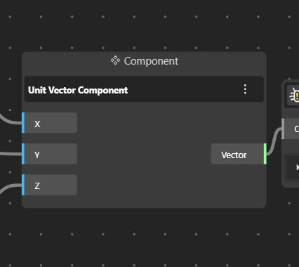
Left Side – Inputs:
This is where you decide which parameters you want to keep flexible. The left panel shows all the inputs the component needs — for example numbers, curves, sliders, text, or geometry. These are the values you will change later when you use the component in a model.
Middle – Component Body:
This section displays the name of the component. It represents the packaged logic or the set of nodes you grouped together.
Right Side – Outputs:
This side shows the data or geometry the component produces. You can connect a wire from these outputs to any other node or part of your model to continue building your design.
Together, these parts let you reuse complex logic easily: you plug in the inputs, the component processes them, and you send the output further into your model.
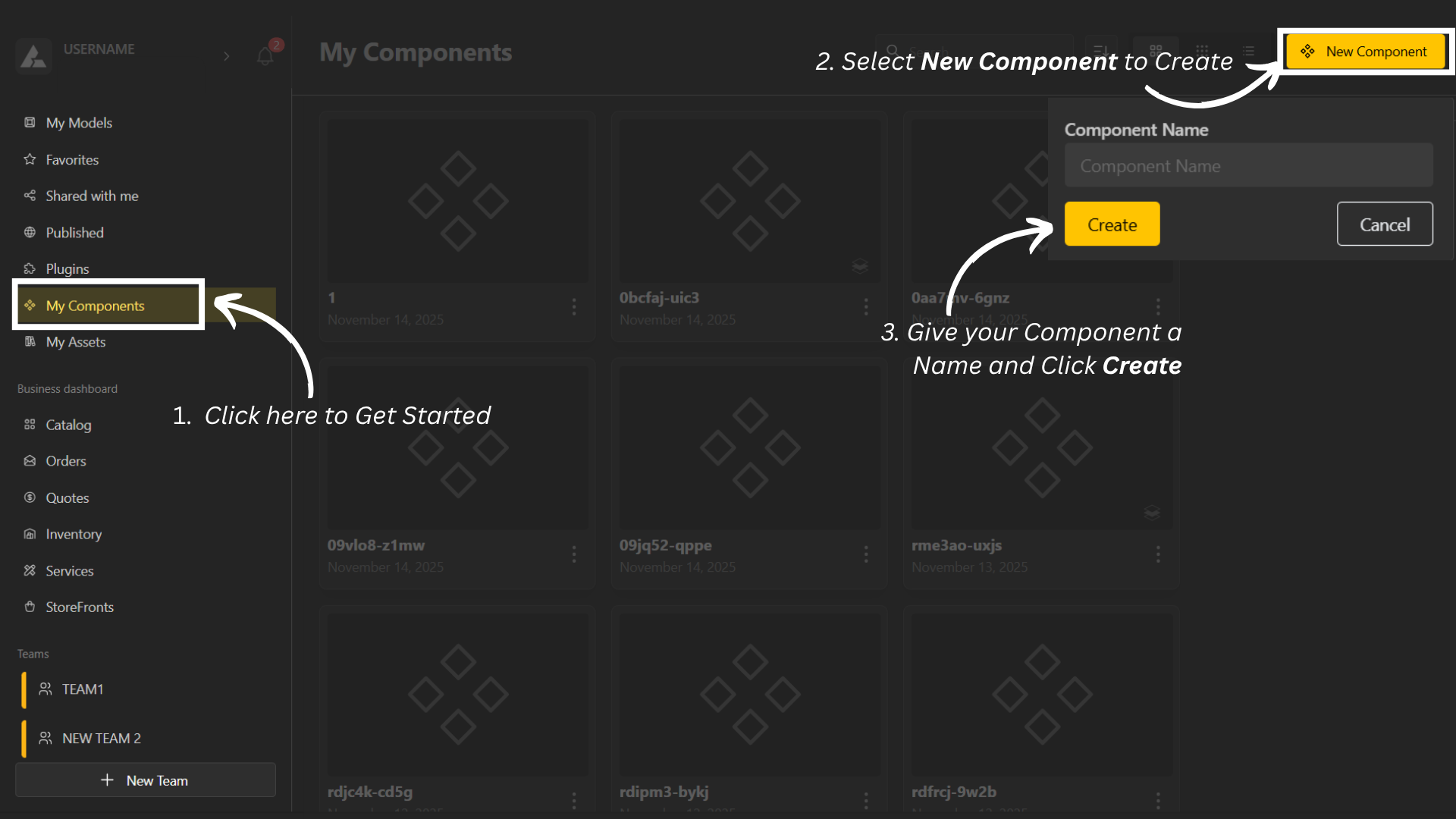
On the left menu, click Components.
Select Create New Component.
Give your component a name, and you’re ready to start building it.
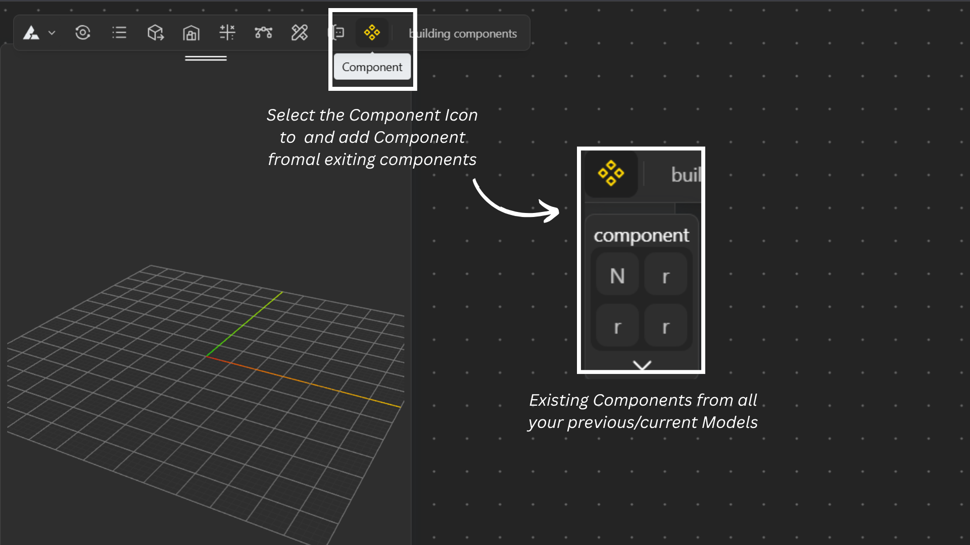
Open BeeGraphy Editor.
Navigate to the Components icon in the top menu.
Click the icon to open a dropdown showing all components available in your workspace.
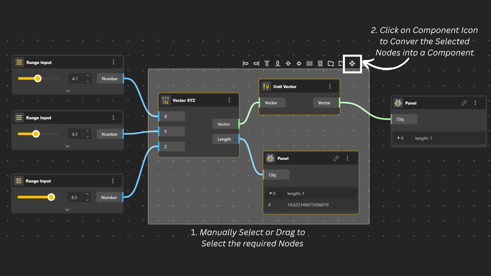
In your model, select the nodes you want to turn into a component
– either by dragging your mouse to highlight them
– or selecting them manually.
Click the Components icon and choose Create Component.
Your selected nodes will now be packaged into a single component block.
Double-click the name to rename it.
The component you created is now available across all your models and can be easily reused in different models.
Click the three-dot menu on the component to access actions:
Hide – Temporarily hide the component in the canvas.
Disable – Turn off the component so it doesn’t run inside the model.
Delete Node – Remove the component from the model.
Learn More – Open detailed information about the component.
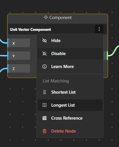
Shortest List: Pairs items from two lists only until the shortest list runs out.
Example: When you have 1 ball and 3 boxes. The ball can only be put into one box leaving the extra boxes remain unused.
Ball 1 → Box 1 Box 2, Box 3 unused
Longest List: Continues pairing until the longest list ends. If one list is shorter, its last item is repeated.
Example: When you have 3 balls and 1 box. The single box is applied to all three balls i.e. the shorter list repeats to match the length of the longer list.
Ball 1 → Box 1
Ball 2 → Box 1
Ball 3 → Box 1
Cross Reference: Creates every possible combination between two lists.
Example: When you have 2 balls and 3 boxes. Each ball can now go into each box in a cross-combination, creating all possible pairings.
Ball 1 → Box 1, Box 2, Box 3
Ball 2 → Box 1, Box 2, Box 3
Components are automatically shared within the team by default, making it easy for members to reuse, update, or edit them whenever needed.
Head to Teams from the top-right menu. There, you can access all previously created components. Every component available there is free to use within your team.
Another way to find components is by opening the specific project you’re working on. Click the Components icon to view all components belonging to that model.
Build Components in BeeGraphy Step-By-Step Guide
To make Components easier to grasp, we’ve included a few quick examples so you can get comfortable with how they work.